Understanding the difference of Beers on a Restaurant Menu
January 4, 2007
This is the first post in a new series called “The Design of Everyday Things.” There is a book by this title but I have not yet read it yet. It is probably the next book I will buy.
Last night I ate dinner with some friends at the RockBottom Brewery in downtown Denver. The waitress came over to explain the menu, focusing on the beers that they brewed in their own brewery.But the waitress said that the menu page with the beers was confusing because they were not arranged in any order (Figure 1).

[Figure 1]
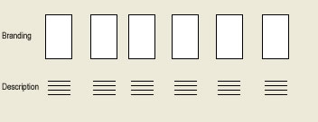
The restaurant had made a second separate piece that displayed the six beers were horizontally with their unique branding logo and a description/teaser underneath. The waitress explained that the beers were in order from lightest to darkest. (Figure 2).

[Figure 2]
But it left me wondering if they went to all this trouble to come up with a separate sheet to explain their beers, why didn’t they go an extra step and put a gradient at the bottom with labeling lightest to darkest (Figure 3). That would have made this piece be able to stand alone without any explanation and given the information graphically.

[Figure 3]
My other thought is if they know that the way the beers are presented in the menu are problematic, why not change the menu instead of having to have a second stand alone piece?