CSS Trick: Inner Border Gradient
September 29, 2021
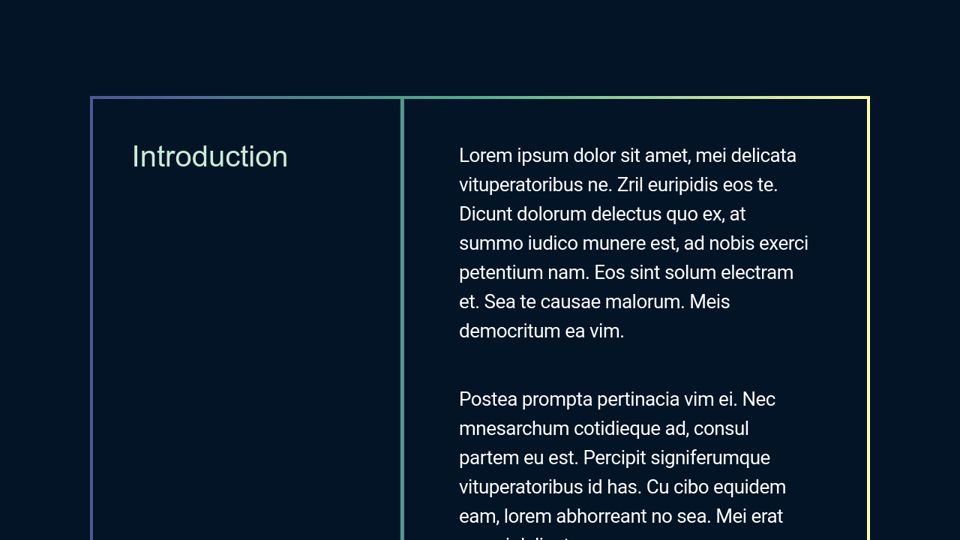
On Tuesday, I was working on a new client project and I needed a solution for gradient borders. The design had two columns of content with a border around the parent element and had a border between the two columns.
<div class="box">
  <h2>...</h2>
  <div class="intro-body">...</div>
</div>
My original solution was to apply a background gradient to the parent element and then put a margin on the two columns and a background-color to mask the parent element to create the borders.
But that solution would not work in my project because I need the parent .box to be transparent to see design elements layered underneath. I needed a new solution that would allow for transparency.
I came up with a clever solution using clip-path. I started with using the border-image-slice solution from this article on CSS Tricks for the parent .box element. But I needed a solution for the border between the two columns of content. I needed the border to be the same color as the color in the gradient on the top and bottom borders.
My CSS Trick was to use a ::after pseudo-element on the .box element which was absolutely positioned to be the full width and height of the parent .box element. I applied the same background gradient as the border and used clip-path to only show 4px of the pseudo-element (creating the border). I also created a fallback for browsers that do not support clip-path getting a solid border on the box and the inner border.

clip-path on and offI put flex-basis: 40.29% on the introduction text (h2) so it that its width will be 40.29% of the width of the .box. Then the clip-path on the ::after element is clip-path: polygon(calc(40.2% - 5px) 0, 40.2% 0, 40.2% 100%, calc(40.2% - 5px) 100%). This places the border just inside the right edge of the h2 element. I ended up subtracting 5px because visually it did not look as thick as the 4px border on the .box.