Case Study for Destino Movement

Destino is Campus Crusade for Christ’s contextualized ministry to Latino students and their community. Their leadership approached me because they wanted a new Website.
Launched September 2009
Define Objectives
After my initial meeting with the client, I came away with the 5 objectives:
- simplify the interface
- make it easier for non-technical people to update the site
- give it a personality that connected to Latino students
- a design (and content) to boost the credibility of the Destino brand
- make it easy for students to connect with Destino
Simplified Site Architecture and WordPress Backend
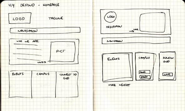
Simplifying the site was a matter of auditing the content and then creating a new information architecture to support those changes. After coming up with a simplified site architecture, I wireframed my ideas for the new homepage.

Their current site was a static HTML site. I knew that moving them to a content management system would help fulfill one of their objectives. WordPress was my choice for empowering the Destino team to manage and add future content to the site. My decision was based on the clean, usable interface of WordPress that would make it easy for Destino to manage their site.
Research & Mood Boards

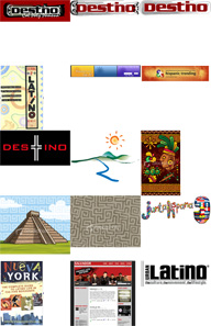
One of the mood boards I put together.
The biggest challenge was giving the site a new graphic identity that would fulfill the final 2 objectives. I started this phase of the project by reading a Latino culture for Dummies book. I knew that I needed to have a better understanding of my audience if I was going to be able to design for them.
Next, I started putting together mood boards as I visited sites like iStock, Veer, Google images using different key words and values that I had uncovered in my research into Latino culture. I was trying to find common graphical elements that the breadth of Latino culture shared.
What I found is that each culture with what we call Latino is very diverse. I found that creating a common visual identity was quite a challenge and I did not want to settle for a cliché. Too many other Web designs were doing that already.
First Round of Design Comps
I started to explore different ideas visually. My first ideas focused on vibrant colors, the sun, and the spiral as a textural element in the background. My art director did not feel like that was coming together so he encouraged me to pursue a different direction.
Another Direction
I started pursuing more of an urban grunge look at his suggestion. He grew up around Los Angeles and that was something that was familiar to him. Although the project had not mandated a new logo identity, I began working on a logo that I incorporated into the second design idea.
I took the idea of the sun and community along with a gothic font for the lettering to give it a more urban edge. A lot of my time was focused on the logo.

When we presented it to the client, they did not want to commit to that direction. They were in the midst of a leadership change and felt more comfortable with the current logo and branding. Destino also voiced some concerns about the urban look appealing to certain segments of their audience.
My art director was very happy with my process and the Destino leadership did come back to me later wanting to review the logo idea.
A Simpler Solution
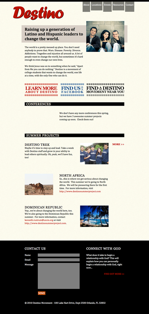
I took a step back and decided to pursue a simplier solution. Designs by Elliot Jay Stocks and Mike Kus influenced the simplier direction I chose. My final solution utilized a neutral background color with noise added for texture. The neutral colors made the red and black brand colors of the Destino pop. I incorporated the spiral as a border in the main calls to action on the homepage.
Destino’s old site had very little imagery. An early decision I made was to incorporate imagery of Latino students into every page of the site. I believe that imagery of people builds a strong emotional connection with the audience. Relationships are really valued in Latino community so most of the pictures I chose had multiple people. The imagery became the focal point to creating a personality to connect with the audience.
The design of the homepage focused on calls to action to connect to Destino in one of many ways–finding out more about a relationship with God, connecting to an existing Destino movement, finding out about conferences and mission opportunities, or starting a new local movement on the student’s campus if one did not exist.

Mocking it up in HTML & CSS
Before showing the client the design, I decided to build out the design. In a lot of my designs, I will move to designing in the browser after I have a good direction started in a graphics program. It is much easier to design interactivity by having a working design instead a static Fireworks or Photoshop document.
Building it out in HTML and CSS gave me a chance to explore and finalize details of the design. It also served as the foundation of the final Web code.
Final Refinement
After getting the client’s approval with the design direction, I went back to the design to add some shine. I adjusted the alignment of certain elements and pushed others outside of the grid.
I used jQuery to create a nicer scroll down from the contact link at the top of the page to the form at the bottom. I also used jQuery to allow the form text area to grow as the user populated it with content. I was influenced by Facebook’s interaction.
Building Site in WordPress
I chose WordPress as a backend solution because I wanted to empower the site owners to update their own content without having to have technical knowledge.
My next challenge was to determine how to code out the templates in order to tap into WordPress’s dynamic functionality.
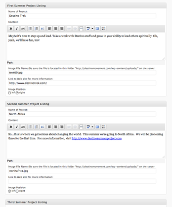
I found a plug-in called More Fields that allowed me to create a custom page type for the homepage. Using WordPress’s custom fields, I created a backend template that would allow Destino to update the teaser and the conference and summer project information on the homepage. I crafted that experience with the end user of Destino staff in mind.
Another feature of the site was tapping into Campus Crusade’s InfoBase API to create a dynamic listing of Destino campuses. I enlisted the help of one my fellow Campus Crusade staff to program the PHP to create a contextualized ministry locations page for the Destino ministry.
Destino had entered that information manually in the past and it quickly became dated. Now staff on the field could update their information through a Campus Crusade staff interface and the Destino site would draw from that database.
Finally, I created a PDF guide for the Destino staff that introduced them to the WordPress interface so they could update their content.
Results
- Very positive feedback about the visual design and simplified site architecture from both the Destino leadership and Campus ministry staff working directly with students
- Design achieved the goal of connecting with Latino students
- The Destino staff began updating the site on their own with very little additional guidance from me thanks to the PDF guide I created for them
- Destino was proud of their site and were excited to guide people to it for more information
- With a renewed site, they began adding video to enhance the experience
